목차
position 예제 - body 기준으로 절대위치 지정 position 정의 position 구문 position:static 예제 position:absolute 예제 position:fixed 예제 position:relative 예제 position:sticky 예제 주의 - 로딩 속도 느려지는 구조 (제 경험 ㅡㅡ;) position:absolute 이용해 화면고정 position 속성 이용한 중앙 정렬 position 예제 - div 요소 순서 변경 (PC:ab순 → 모바일:ba순) position 관련주소
position 예제 - body 기준으로 절대위치 지정
<style>
h2 {
position: absolute;
left: 100px;
top: 150px;
color:red;
}
</style>
<h1>홈짱닷컴</h1>
<h2>Homzzang.com</h2>
<p>홈페이지 제작관리</p>
결과보기
position 정의
해당 태그 위치를 어디를 기준으로 위치시킬건지 기준 대상을 정함.
1. position 속성은 top right bottom left 속성과 함께 사용됨.
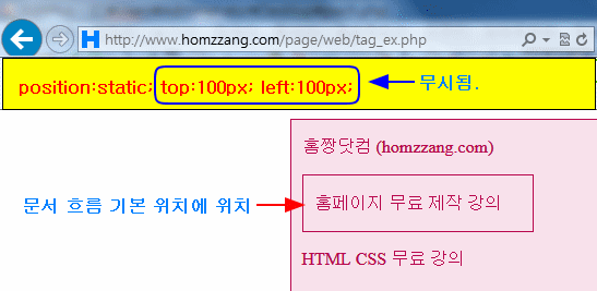
단, position 속성의 속성값이 static일 때는 단독 사용 가능. 즉, position:static일 땐, 함께 사용된 top right bottom left 속성이 무시됨
2. position 속성이 기준으로 삼을 대상을 선정하는 거라면 , top right bottom left 는 position 속성이 지정한 대상의 어디 구석을 기준으로 삼을 것인지 지정 함. position으로 기준 대상 정해지면, 이 기준으로 정확한 위치 재조정.
top : 양수px - 상단기준 / 아래로 이동 (예) top:50px ; top: 음수px - 상단기준 / 위로 이동 (예) top: -50px ; bottom: 양수px - 하단기준 / 위로 이동 (예) bottom:50px ; bottom: 음수px - 하단기준 / 아래로 이동 (예) bottom: -50px ; left: 양수px - 좌측기준 / 오른쪽으로 이동 (예) left: 50px; left: 음수px - 좌측기준 / 왼쪽으로 이동 (예) left: -50px; right: 양수px - 우측기준 / 왼쪽으로 이동 (예) right: 50px; right: 음수px - 우측기준 / 오른쪽으로 이동 (예) right: -50px;
3. 기본값 : static 상속여부 : X 애니효과 : X CSS버전 : CSS2 JS구문 : object .style.position ="absolute"
4.
일부 속성값은 IE7부터 지원. sticky 속성값은 IE 지원 X
position 구문
선택자 { position:속성값 ;}
[속성값]
static
문서 흐름에 따른 기본 위치 (기본값) top right bottom left 등 위치 속성은 무시됨.
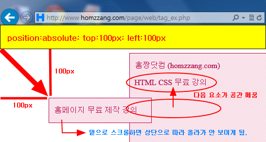
absolute (static 이 아닌) 첫 번째 부모 요소 있으면 해당 부모 요소 기준 . ※ 부모 요소 기준으로 하려면, 부모 요소가 relative, absolute, fixed 속성 중 하나여야 함. (static 이 아닌) 첫 번째 부모 요소 없는 경우엔 브라우저 창 기준. 스크롤 하면 위치 변동. 정확한 위치는 top right bottom left 속성 이용해 정함 . 해당 요소의 다음에 있던 요소가 그 자리 차지. 가로세로 중앙 정렬 위해 함께 사용할 속성: left:50%; top:50%; transform: translate(-50%, -50%);
relative
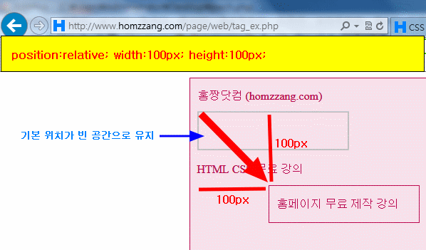
static일 때 해당 요소의 현재 기본 위치 기준 정확한 위치는 top right bottom left 속성 이용 . 해당 요소의 기본 위치가 빈 공간으로 유지
fixed
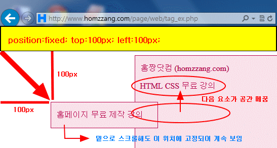
무조건 브라우저 창 기준. 정확한 위치는 top right bottom left 속성 이용해 정함 . 해당 요소의 다음에 있던 요소가 그 자리를 차지. 홈페이지 로딩 늦는 원인 될 수 있으니 주의 !! (맨 하단 참고) IE7 이상 지원
sticky
relative처럼 작동하다가, 스크롤 시 설정된 top , left 값 위치 도달시 거기에 고정. relative와 다른 점은 right, bottom 속성값 적용 X. (실제 해보니 ㅡㅡ;) 스크롤 상단 고정 메뉴 만들 때 사용. 3. 브라우저에 따라 overflow:hidden 또는 overflow:auto 일 때 작동 안 될 수 있음.IE 지원 X
unset 속성을 부모로부터 상속받은 경우 그 상속값으로, 아니면 초기값으로 재설정
※ 아래 예제들의 .parent 선택자에 아래 속성 추가하면서 변화 확인 권장 !!
position:relative; position:absolute; position:fixed; position:sticky;
position:static
<style> .parent { width: 720px; height: 1000px; margin: auto; border: 1px solid #b8064d; background-color: #f8e1eb; color:#b8064d;
padding-left:10px; } .me { width: 200px; border: 1px solid #b8064d; background-color: #f8e1eb; top: 100px; left: 100px; color:#b8064d; ="color:>
padding-left:10px } .child {
background-color:yellow; color:black;
} </style>
<div class="parent"> <p>홈짱닷컴 (homzzang.com)</p> <div class="me"> <p class="child" >홈페이지 무료 제작 강의</p>
</div> <p>HTML CSS 무료 강의</p> </div>
position:absolute 예제
.parent 선택자에 position:absolute 없는 경우 : 브라우저 창 기준.
<style> .parent { width: 720px; height: 1000px; margin: auto; border: 1px solid #b8064d; background-color: #f8e1eb; color:#b8064d;
padding-left:10px; } .me { width: 200px; border: 1px solid #b8064d; background-color: #f8e1eb; position: absolute ; /* 브라우저 창 기준 */ top : 100px; left : 100px; color:#b8064d;
padding-left:10px } .child {
background-color:yellow; color:black;
} </style>
<div class="parent">
<p>홈짱닷컴 (homzzang.com)</p> <div class="me"> <p class="child" >홈페이지 무료 제작 강의</p>
</div> <p>HTML CSS 무료 강의</p> </div>
cf. .parent 선택자에 position:absolute 있는 경우 : 부모 요소 기준.
<style>
.parent {
width:680px ;
height: 500px;
border: 1px solid #b8064d;
background-color: #f8e1eb;
color:#b8064d;
padding-left:10px;
position: absolute; /*윈도우 창 기준 */
top: 50px;
right: 100px;
}
.me {
width: 200px;
border: 1px solid #b8064d;
background-color: #f8e1eb;
position: absolute; /* 부모요소인 .parent 기준 */
top: 100px;
left: 100px;
color:#b8064d;
padding-left:10px
}
.child {
background-color:yellow; color:black;
}
</style>
<div class="parent">
<p>홈짱닷컴 (homzzang.com)</p>
<div class="me">
<p class="child">홈페이지 무료 제작 강의</p>
</div>
<p>HTML CSS 무료 강의</p>
</div>
결과보기
position:fixed 예제
<style> .parent { width: 720px; height: 1000px; margin: auto; border: 1px solid #b8064d; background-color: #f8e1eb; color:#b8064d;
padding-left:10px
position:relative; .me { width: 200px; border: 1px solid #b8064d; background-color: #f8e1eb; position: fixed ; /* 브라우저 창 기준 */ top : 100px; left : 100px; color:#b8064d;
padding-left:10px } .child {
background-color:yellow; color:black;
} </style>
<div class="parent">
<p>홈짱닷컴 (homzzang.com)</p> <div class="me"> <p class="child" >홈페이지 무료 제작 강의</p>
</div> <p>HTML CSS 무료 강의</p> </div>
position:relative 예제
<style> .parent { width: 720px; height: 1000px; margin: auto; border: 1px solid #b8064d; background-color: #f8e1eb; color:#b8064d;
padding-left:10px } .me { width: 200px; border: 1px solid #b8064d; background-color: #f8e1eb; position: relative ; top : 100px; left : 100px; color:#b8064d;
padding-left:10px } .child {
background-color:yellow; color:black;
} </style>
<div class="parent">
<p>홈짱닷컴 (homzzang.com)</p> <div class="me"> <p class="child" >홈페이지 무료 제작 강의</p>
</div> <p>HTML CSS 무료 강의</p> </div>
position:sticky 예제
※ IE 지원 X
<style>
.parent { width: 720px; height: 1000px; margin: auto; border: 1px solid #b8064d; background-color: #f8e1eb; color:#b8064d;
padding-left:10px } .me { width: 200px; border: 1px solid #b8064d; background-color: #f8e1eb; position: sticky ; top : 10px; left : 100px; color:#b8064d;
padding-left:10px } .child {
background-color:yellow; color:black;
} </style>
<div class="parent">
<p>홈짱닷컴 (homzzang.com)</p> <div class="me"> <p class="child" >홈페이지 무료 제작 강의</p>
</div> <p>HTML CSS 무료 강의</p> </div>
주의 - 로딩 속도 느려지는 구조 (제 경험 ㅡㅡ;)
<div style=" position:relative ;">
<div style=" position:fixed ; background:red;">
<div style=" position:absolute ; top:-60px; left:-100px; padding:0px">
홈짱닷컴 Homzzang.com
</div>
</div>
</div>
position:absolute 이용해 화면고정
<!doctype html>
<html lang="ko">
<head>
<meta charset="UTF-8">
<title>문서</title>
<style>
html {
overflow:hidden;
}
html, body {
width:100%;
height:100%;
margin:0;
padding:0;
}
#wrapper {
width:100%;
height:calc(100% - 70px);
position:absolute;
overflow-y:scroll;
border:5px solid red;
}
#qwe {
width:300px;
height:50px;
border:2px solid #ccc;
background:#ddd;
position:absolute;
left:calc(50% - 150px);
bottom:0;
overflow:hidden;
text-align:center;
}
</style>
</head>
<body>
<div id="wrapper">
<div id="content">
<script>
for(i=0; i<100; i++) {
document.write("조민 님 사랑해용. ^!~<br>");
}
</script>
</div>
</div>
<div id="qwe">
신청서 입력<br>
<input type="text" name="">
<input type="submit">
</div>
</body>
</html>
결과보기
조민 님 (190328) https://sir.kr/qa/298015
position 속성 이용한 중앙 정렬
[방법1] - transform:translate(-50%, -50%); 이용한 위치 보정
div {
padding:50px;
width:300px;
color:white;
background:red;
position:absolute;
top:50%;
left:50%;
transform :translate(-50%, -50%);
box-sizing:border-box;
}
span {
position:absolute;
top:50%;
left:50%;
transform:translate(-50%, 400%);
box-sizing:border-box;
}
</style>
<div>홈짱닷컴 Homzzang.com</div>
<span>홈페이지 제작 관리</span>
결과보기
[방법2] - calc() 함수 이용한 위치 보정
<style>
div {
padding:50px;
width:300px;
color:white;
background:red;
position:absolute;
top:calc(50% - 50px);
left:calc(50% - 150px);
box-sizing:border-box;
}
span {
position:absolute;
top:calc(50% + 100px);
left:calc(50% - 80px);
box-sizing:border-box;
}
<div>홈짱닷컴 Homzzang.com</div>
<span>홈페이지 제작 관리</span>
결과보기
PS.https://homzzang.com/b/css-282
https://homzzang.com/b/css-313
position 예제 - div 요소 순서 변경 (PC:ab순 → 모바일:ba순)
<style>
* {margin:0; padding:0;}
div {
border:1px solid red;
float:left;
width:50%;
height:100px;
box-sizing:border-box;
}
@media all and (max-width:750px ) {
div {
clear:both;
width:100%;
box-sizing:border-box;
}
div.a {
position:absolute; top:100px;
}
div.b {
position:absolute; top:0;
border-bottom:none;
}
}
</style>
<div class='a'>a</div>
<div class='b'>b</div>
결과보기
PS. flex의 order 속성 이용해 구현 가능.
position 관련주소
엘리 님 (display + position) 강의
https://youtu.be/jWh3IbgMUPI
mdn position 강의
https://developer.mozilla.org/en-US/docs/Web/CSS/position

최신댓글